 I've been working in a 5x7 format so I can print here at home and I've been using some of the pages I create as cards. I think this one will make a nice card.
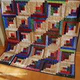
Speaking of nice, Kathie sent me a beautiful top to quilt and donate for HeartStrings. I really appreciate the opportunity to finish and donate the tops sent to me and with the others that have arrived in the last couple weeks, I'll have plenty of quilting to do in the next few months. I can't wait to show you my progress.

Email me


4 comments:
Oh Mary, I love the blue tinge if that's the word. Yep you are getting something out of those lessons...excellent.
Heartstrings will be very happy with another of your quilted creations.
I think a nice refresher of the principles of layout is good, but I'm glad you're going in your own direction.
I love the blue tinge too. Also the sentiments expressed.I make a point of telling my family members I love them, every time I talk to them, or see them. Who knows what lies ahead...
Many magazine designers share your philosophy.
Simple is clean and fresh. It is appealing to the eye.
Yes, this page would make a great card.
Post a Comment